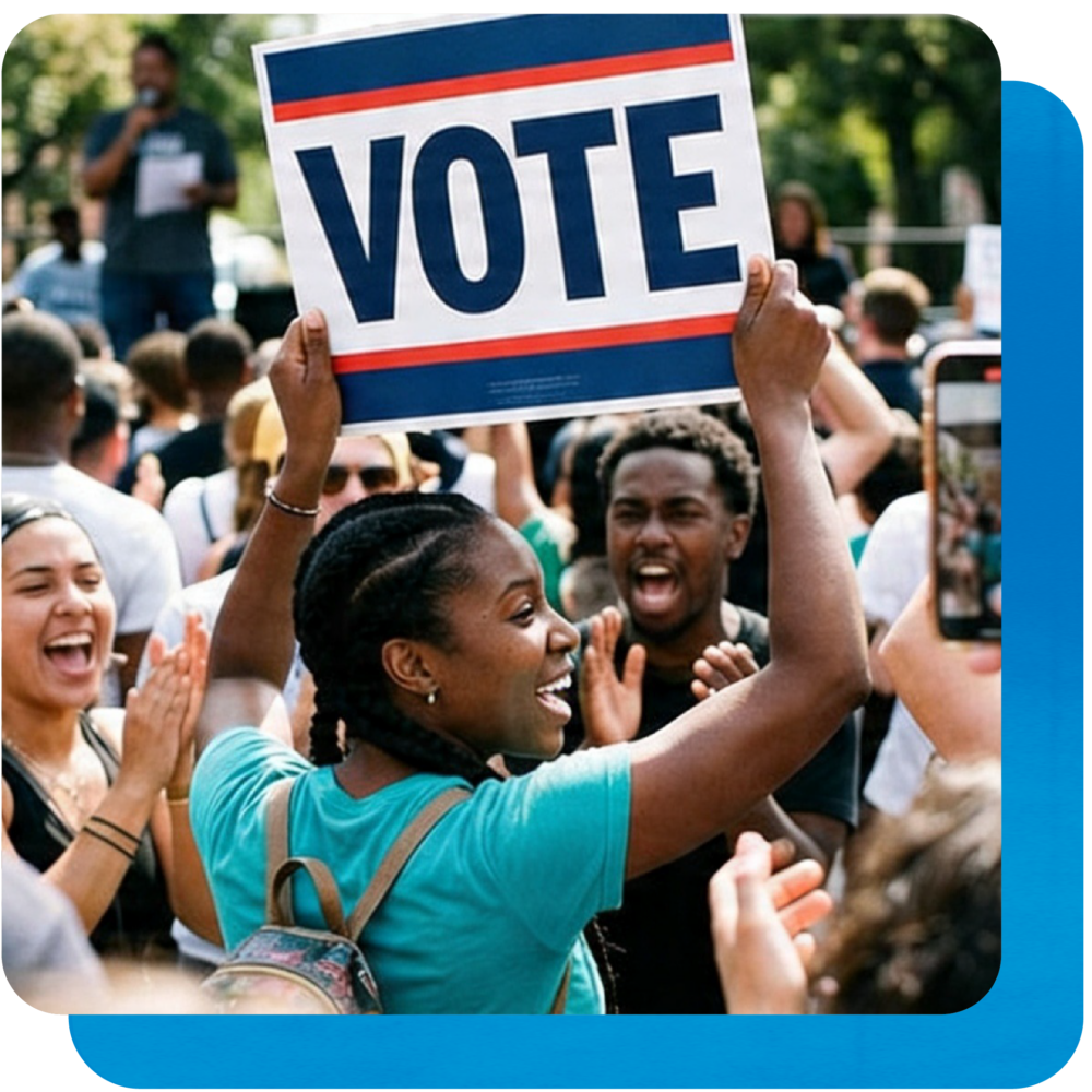
Yes — and here’s why it matters more than you might think.
Your campaign website is often the first place a voter goes after they hear your name: at a candidate forum, from a neighbor, on a yard sign in front of someone’s house. What they find there in the next 30 seconds will shape how they think about you for the rest of the race.
In a down-ballot race, you don’t get many chances to make that impression. Flyers get recycled. Social posts disappear in the algorithm. A website stays up, works around the clock, and gives voters a place to go when they’re ready to decide whether you’re worth their attention.
But here’s the good news: voters aren’t looking for anything complicated. Most of them are asking the same handful of questions every time they land on a candidate’s site. Get those answers right, and your website does real work for your campaign. Here’s what to include.
1. Your reason for running
Voters don’t come to your website to read a resume. They come to figure out if you’re someone worth paying attention to. That’s a different question that calls for a different answer.
Most candidate websites open with a bio: years in the community, professional background, family details, maybe a quote about public service. That information has a place, but it shouldn’t lead. What voters are actually looking for in those first few seconds is your “why”: the reason you got into this race, in plain language.
“Lifelong resident and parent of three” is fine background context. But “Running because our school board hasn’t held a public meeting in eight months” gives the voter a reason to keep reading. Lead with what moved you to file, and your bio will land harder because of it. Voters want to understand the person behind the campaign before they start evaluating the candidate.
2. Positions on local issues
Voters in local and state races are often focused on one or two specific issues; a road that’s been under construction for two years, a school rezoning fight, a housing development their neighborhood is divided on, a local business district that feels like it’s been forgotten. Generic values statements don’t do much for someone who’s already thinking about a specific problem.
Your issues page needs to reflect that you understand what’s actually happening in your community. Not just that you care about “safe streets” or “quality education,” but what that means in your district, in this election cycle, right now. Name the specific issues your community is dealing with. Take a position on them. Explain what you’d actually do.
Even if a voter disagrees with you on something, clarity reads as confidence, and confidence is a big part of what they’re evaluating in a candidate they’ve never heard of before. Vague statements don’t inspire trust. Specific ones do, even if they’re imperfect.
3. Proof you’re a serious candidate
Down-ballot races are full of candidates voters have never encountered before. When someone lands on your website, they’re doing a quick credibility check, whether they realize it or not. They want to know that this isn’t a vanity run, that you’ve thought through what you’re doing, and that you have some level of support from people or organizations they might recognize.
Endorsements help. A real, professional-looking photo helps (not a stock image, not a blurry crop from a group photo). A local organization affiliation, a press mention, a quote from a community leader: all of these tell a voter that you’ve put in the work before asking for their vote.
The design of your site sends a signal, too. A website that looks thrown together, loads slowly, or feels like a placeholder tells a voter something about how you approach things. It doesn’t have to be elaborate, but it does have to look intentional. Voters make fast judgments, and first impressions in a down-ballot race are hard to undo.
4. A clear path to getting involved
Every page of your site should answer one question: what do you want this visitor to do next? Donate. Volunteer. Sign up for updates before the next town hall. The right answer depends on where you are in your campaign, but it should always be one action per page, not four actions competing for the same attention.
This is where a lot of candidate websites quietly lose people. Donation buttons buried at the bottom of a long page. Volunteer forms that ask for more information than necessary. Email sign-ups with no explanation of what someone’s actually getting by joining your list. Every extra step or moment of confusion between a visitor and an action is an opportunity for them to close the tab and move on.
Think about what you most need from supporters right now and build your site around that. If you’re early in your race and list-building matters most, make your email sign-up prominent and tell people exactly what they’ll hear from you. If you’re heading into a fundraising push, your donation CTA should be impossible to miss. Make it easy, make it obvious, and resist the urge to ask for everything at once.
5. A mobile-friendly experience
This one doesn’t get enough attention! Most voters who land on your website are going to find it on their phone — probably while they’re doing something else, maybe while they’re standing in line or sitting in their car. If your site loads slowly, displays text that’s hard to read, has buttons that are too small to tap, or just doesn’t behave the way they expect, they’re gone. And they’re probably not coming back.
Mobile performance isn’t a nice-to-have for campaign websites. It’s the baseline. More than 60% of political web traffic comes from mobile devices, which means a site that looks great on a desktop but falls apart on a phone is effectively failing the majority of your visitors.
This is also one of the things that’s hardest to get right when you’re building on a platform that wasn’t designed with campaigns in mind. Generic website builders optimize for desktop-first experiences and consumer behavior. A campaign website builder accounts for how voters actually find you and what they need when they do.
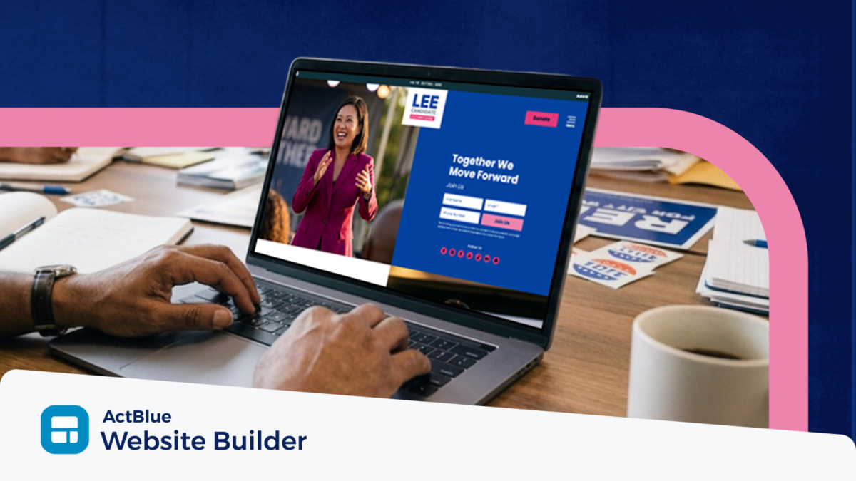
ActBlue Website Builder: built for campaigns, not coffee shops
Most of what voters are looking for comes down to one question: does this site feel like it was put together by someone who’s serious about running?
That’s hard to pull off when you’re fighting with a template that was built for a restaurant or photography portfolio.
ActBlue Website Builder was designed specifically for first-time Democratic candidates with ready-to-go templates that include endorsement sections, volunteer sign-ups, and donation CTAs. Mobile performance and accessibility are built in by default. And because it’s built by ActBlue, your website and your fundraising are part of the same ecosystem from day one.
Ready to get online? Launch your website with ActBlue Website Builder today.
Built for you. Built to win.
- Fundraising
- Field Tools
- Website Builder